The psychology of branding and the power of vehicle advertising
In the world of digital display, printed and neon signs, as well as online, mobile, billboard, media, and magazine advertising, there still are a small number of sign makers specialised in old lettering techniques.
beginning of the 20th century – the era of signwriting
The roots of British advertising practices stem from the art of signwriting. Signs were routinely used for adverts from the late 19th century through early 20th century. The British have a very strong signwriting history, which nowadays has morphed into the art of sign-making and digital advertising.
The fastest method of signwriting is stroke lettering – quickly executed copies without the use of a drawing. This technique was used for cheaper and smaller jobs. Similarly, the style was used when working under pressure. Hand-painted horse racing results and betting signs were used to get the information out quickly.
advertising in the 1930s and 1940s – ROMAN LETTERING, ENVIRONMENTALISM, AND ERA OF PRINT ADS
In terms of advertising trends, at the start of the 20th century, environmentalism became a mainstream feature in advertisements. The pioneer was Shell Oil, whose artists in 1930s started to use nature and country scenes on ads, therefore branding itself as environmentally friendly.
Around the same time, graphic design started to grow in popularity, especially for shop signs. As pubs were in high demand, decorative styles and gold leaf painting remained a popular service for signwriters.
Later on, Lipton tea and grocery chains owned by Thomas Lipton used excessive advertising to craft the brand as the epitome of affordable quality. Lipton sold tea in single-use packaging, using this as an opportunity to print advertisements on each teabag package, which contained the slogan “Direct from the tea garden to teapot.”
As Lipton himself was positively perceived by the public, by engaging in large amounts of charity work, he made sure to link the Lipton tea brand to his brand to drive the business.
advertising in the 1950s – billboard and poster takeover
In the 1950s signwriting started to be overtaken by billboards, mass-produced posters, as they were cheaper to buy and produce.
With the technological advancements, the individual skill of signwriting became less sought after, as computers, plastic, neon signs, and machine-made lettering replaced it.
In the 1950s, the British public became increasingly aware and concerned with the cancer risks associated with smoking tobacco. In order to combat the growing concern, industry players reverted to false advertising, as well as advertising to adolescent and foreign markets. Eventually, government anti-smoking programs were created, heavier taxations introduced, and advertising was itself used to degrade the glorified image of cigarette smoking.
the golden age of advertising – the 60s, 70s, and 80s
Although television advertising in the UK was born in 1955. The early commercials were black and white and much more slow paced and longer than today’s TV commercials. Advertisements were mostly TV adaptations of newspaper and poster ads.
Soon TV ad presenters were introduced, who were usually well-known actors or presenters from TV programs.
Till 1970s advertisements were very easy to produce, as the main ideas was to explain to potential consumers why they should purchase a product, therefore advertising was dominated by food industry and cleaning products. In the 70s it expanded to beer, cigarettes, chocolates, and many more household items.
Up till the 70s, car manufacturers such as Ford, Vauxhall, Chrysler, and Leyland had an agreement not to advertise, but the Japanese Datsun arrived to the British market and car advertisements became more frequent.
In the 80s international advertising was no longer a marketing tool only for big corporations such IBM, General Motors, and McDonald’s, but also for countless other companies around the world, seeking to acquire new customers around the world.
Many shopping tv channels were launched in the 80s, such as Home Shopping Network and QVC.
advertising in the 1990s and early 2000s – the digital revolution
In the middle of 1990s, advertising on vehicles became increasingly popular, as billboard space was limited. One of the greatest vehicle fleet advertisements in the history belongs to Coca Cola. The company has released a Christmas advertisement, featuring a red truck, lit with tens of thousands of light bulbs, with Coca Cola logo and a Santa Claus printed on the side of the truck. The advert has been reproduced year on year since 1995. Coca Cola’s advertisement global influence and impact started even earlier in the 20th century, when in 1931, who drew Coca Cola advertisements with a Santa Claus dressed in the brand famous red colour. Previously the cartoonist Thomas Nast had painted Santa both in green and red, but Coca Cola made the red so famous.
With the arrival of the 21st century, and internet takeover, advertising has gone digital, spreading across websites, search engines, social media, and email campaigns.
Modern-day advertising has enabled businesses to acquire market knowledge, create an online presence, as well as offer customers vast information on the supply chain, quality, and reviews of the products and services advertised to them.
importance of branding
Branding for a business is like its business card — the quick elevator pitch to a new and existing customer base. Through branding and advertising, a company of any size can express their values, beliefs, trustworthiness, while also increasing overall brand awareness.
Brand marketers must develop a relationship with customers and learn what resonates with their target audience. A University of Southern California study has determined that there are five key aspects to crafting the personality of a brand:
- Sincerity
- Competence
- Excitement
- Sophistication
- Ruggedness
When making a purchasing decision, customers will subconsciously remember the feelings and emotions they experienced when seeing a brand’s logo or advertisement, and associate them with the brand, even if they don’t consciously remember the actual ad.
For example, if through an advertisement John Deere convincingly demonstrates the quality and efficiency of their vehicles, as well as how tough and resistant they are, then a consumer may feel compelled to choose this brand over another, due to their personal associations of safety and dependability.
psychology of branding and advertising
A brand image is more than just the design or logo of a company — it is the messaging, the customer relationship, the memories, as well as expectations of the brand. All these aspects form a brand’s personality, which, after that, provokes emotions in customers.
Advertising is the art of getting the right messaging across and portraying the brand in the desired way to attract new customers and to gain customers’ loyalty.
The art of psychology in advertising and branding is in the fact that customers are not always rational, and can be influenced through various psychological tricks.
A great example is Pepsi and Coca Cola paradox. Back in the 1970s, the Pepsi marketing team organised blind taste tests of both brands in malls and found out that more participants preferred the taste of Pepsi over Coke. However, they would not always start buying Pepsi.
Brain scan tests performed during the blind taste test found that parts of the brain, which are associated with positive memories, were active when people were aware that they are drinking Coca Cola. This proves that the brand image plays a significant role and can defeat rational thinking.
psychology of colour in branding
Colour is a fundamental tool used in advertising and branding, as it reinforces the brand’s identity, presence, and qualities of its products and services.
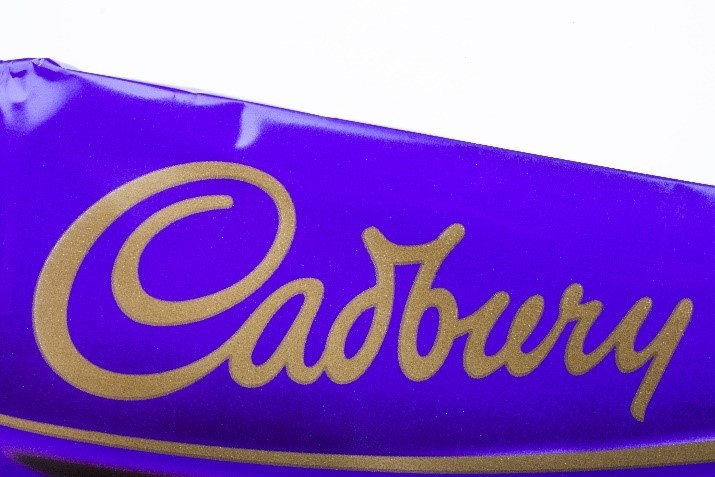
To illustrate the importance of colour in branding, let’s take the example of Cadbury. The chocolate brand was fighting to trademark solo rights to the purple colour tone Pantone 2685C for more than two decades! Some brands have been more successful and have managed to trademark their signature colours, such as the famous Tiffany blue, Barbie pink, and UPS brown pantones.
Why is colour so important?
Research by Colorcom found that colour plays an extremely high (62% to 90%) role in the initial assessment of a product, environment, or a person. Therefore, the effective use of colour in branding and advertising can be a powerful marketing tool and the core part of a brand’s identity and messaging.
Colour influences the perception of the brand, its products, or services, and each colour of the spectrum has its meaning.
Purple
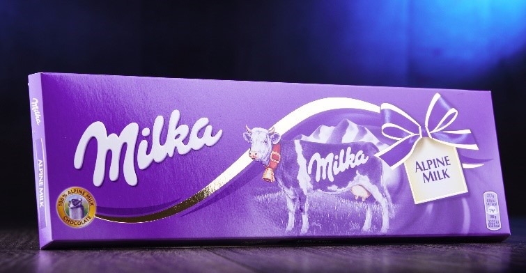
The previously mentioned purple in colour psychology is seen as a royal colour, connecting it to power, luxury, and wisdom. Cadbury is not the only chocolate brand using the purple colour for its branding, as Milka does it too. In addition to representing decadence and luxury, lighter shades of purple such as Milka’s, is associated with fun, happiness, and the youthfulness, which is attractive to customers.
Red
It is claimed that red colour increases heart rate, and therefore, also metabolism and appetite. For example, you may have noticed that many food brand logos are using bright red colour, such as McDonald’s, KFC, Pizza Hut, T.G.I. Fridays, and Kellogg’s.
For example, YouTube also uses the colour red, which is designed to represent the user’s excitement to watch YouTube videos..
Green
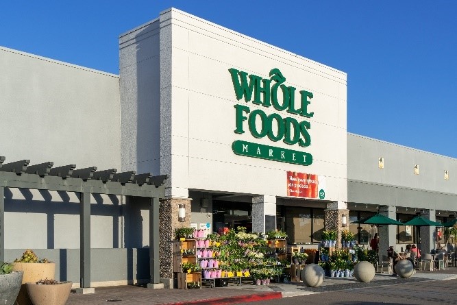
Green, depending on the tone, can be associated with different characteristics. A bright green tone is seen as representing energy (think Spotify), freshness, and health. Deeper green tones symbolise earth and eco-friendliness (Whole Foods), wealth (Land Rover, Lacoste) as well as peace and relaxing (Starbucks, Heineken).
Black and white
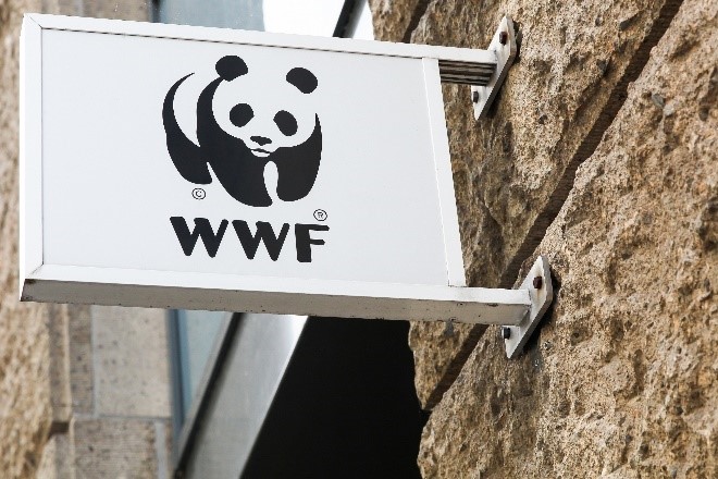
Black and white branding symbolise balance. White signifies cleanliness, innocence, goodness. White and black are often paired using one or the other as the background colour. Brands that use the colours black and white are ASOS, Apple, WWF, Nike, and many luxury brands such as Louis Vuitton, Versace, Chanel, and Prada.
Blue

Blue stands for trust, strength and quality, as well for as stability and peace. It is associated with the sea and the sky. In colour psychology, blue can be used to express the emotions of harmony, peace, calm, and stability. Blue is also broadly used to showcase trustworthiness, and therefore used for guarantee signs and trust certifications. Many healthcare brands and providers, such as NHS and Oral B, use blue to show the reliability and safety of their services and products.
Yellow
Orange represents confidence, creativity (Home Depot) and cheerfulness (Nickelodeon).
However, orange along with yellow and brown, are one of the least liked colours. Therefore, it is often used for smaller accents and calls to action. The exceptions are usually when it’s very representative of the brand, such as in the case of UPS.
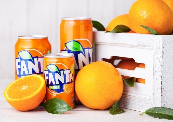
For example, a large part of the Fanta logo is coloured orange, and the colour represents energy and adventure. This goes well with the brand name and image, which comes from the German word Fantasie, meaning imagination.
Pink
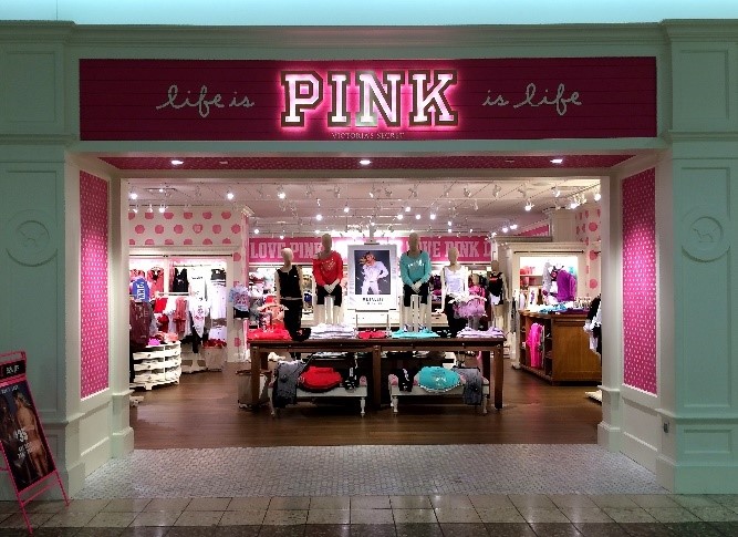
Pink is primarily associated with a female audience and depicts femininity, love, and playfulness. Pink branding is used by the previously mentioned Barbie doll brand, Victoria’s Secret women’s fashion brand, and even as a brand name for their Pink line.
is there a caveat?
It is important to note that colour interpretation is subjective and should be taken with cultural consideration in mind.
What a colour may symbolise in the Western world may be very different in other parts of the world.
For example, in Japan, white signifies death, in China green means infidelity.
In Russia red is the symbol of communism, while at the same time in Asian cultures the same colour represents good luck and longevity.
The right colour selection can enhance your marketing efforts, portray the desired brand image, but do the exact opposite if poorly executed.
psychology of typeface choices
Brand logo and colours are not the only advertising and branding aspects. The choice of typeface can also tell a lot about how the brand wishes to be perceived. The psychology of a font is based on three elements — feelings, associations, and emotions.
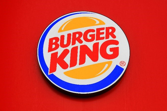
Let’s compare the above Cadbury and Burger King images and the choice of typeface. The Cadbury brand name is written in a script, which is associated with elegance.
This font choice ties in perfectly with the royal purple tone. On the other hand, Burger King uses a strong, modern, and at the same time, a friendly font, which is an excellent fit for their target audience of 15 to 40-year olds.
vehicle wrapping and mobile advertising
Firstly, what is a vehicle wrap? It is an advertisement digitally printed on vinyl and applied to a vehicle using heat. Vehicle wraps can be used by large companies with vehicle fleets, or by small businesses looking for exposure, brand awareness, and new leads.
What are the options of advertising on vehicles, whether it’s a boat, motorcycle, car, or a plane?
- Vinyl wraps
- Vinyl stickers
- Decals
- 3M vinyl film
Nowadays, vehicle wrap advertising is one of the most influential and cost-effective advertising realms out there, which is especially important for medium and small businesses.
Historically, static billboards have been the standard outdoor advertising option, located in strategically chosen areas, at an optimal viewpoint to deliver the messaging to masses of potential customers. From urban areas, billboards grew out to motorways. However, they have become so prevalent, that passers-by don’t always take a glance at what’s out on display.
Here is where mobile advertising and vehicle wrapping comes in play – it is mobile by nature, attracts attention, and can change location.
One of the vehicle wrapping and advertising pioneers back in the 1990s were Crystal Pepsi, who ordered a bus wrapped by a digital design company SuperGraphics in Chrystal Pepsi branding.
Billboard and advertising spaces are expensive, as well as limited, and advertising on vehicles, whether they would be boat wraps, car wraps, van stickers, or decals, is the answer to both problems.
Thus, the industry has expanded, starting with vehicle businesses offering their fleet as advertisements platforms and mobile billboards. Continuously, companies used their vehicles as marketing tools with access to a broad audience.
A study showed that the cost per 1000 advertisement impressions is the lowest for fleet graphics, which is lower than that of radio, outdoor, tv, newspapers, and magazines.
A single vehicle can generate tens of thousands of impressions every day, depending on the location and mileage. The consumer mind is not yet conditioned to ignore vehicle advertising, making it effective and memorable.
Advertising on vehicles, whether through vehicle wrapping or vinyl decals, can reach the entire socioeconomic spectrum. For the cost of vinyl graphic design, printing, and installation, it is possible to achieve a high ROI (return on investment).
Not only mobile advertising on vehicles increases the brand awareness to immediate in-person viewers, but an effective advertisement can be shared on social media and go viral, reaching an even bigger audience.
benefits of vehicle wrapping for mobile advertising
Vehicle wrapping is a value-packed avenue of branding and advertising. Here are the benefits of vehicle wrapping:
- Visually appealing.
- Cost-effective.
- Wide-reaching (socioeconomically and mass audiences).
- Dual-purpose (protects the paint at the same time if you wish to remove it later).
- Hard-working (24/7 presence and depending on mileage can cover a significant location).
- Long-lasting durability (lasts in average six years).
- Professional appearance (looks more professional, manifest presence even outside working hours wherever your van is parked).
- Increased visibility – visible contact details (vehicle branding can serve as a business card).
- Vehicle wrapping options and benefits (long-lasting, can cover up minor damages, etc.).
- Interactive design – QR codes, that people can scan and be taken straight to your website or a specific page on it.
- One-off – payment marketing form.
- Head-turning designs.
For more reasons why vehicle wrapping is a must for SMEs, visit our previous blog post.